Logo Redesign

Raffles for Less is an E-commerce website that prints affordable raffle tickets fast.
After undergoing new ownership in 2020, redesigning their logo was step one. Their previous logo was outdated – using a blocky font and colors that competed for attention; however, the client wanted a few elements to remain.
Now, the business is ran as a subsidiary within a mom-and-pop print shop, and we highlighted this by drawing handletting for the word Raffles. While the new logo is more modern, we chose to have vintage elements with a touch vermilion to connect with the history of the raffle ticket.
The Raffles for Less logo redesign was a success for the client and customer base. After redesigning the logo, we established brand guidelines and marketing materials.


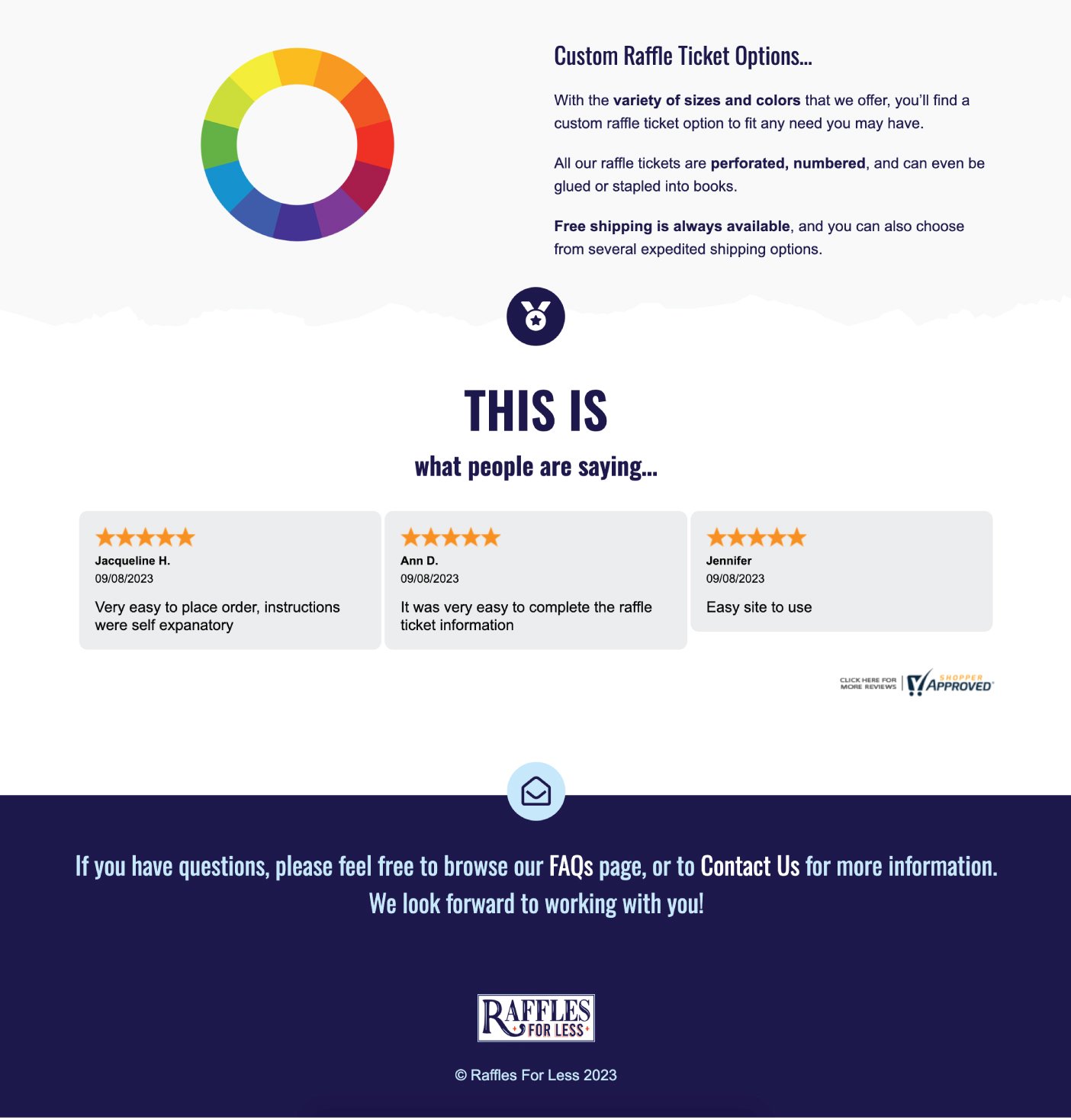
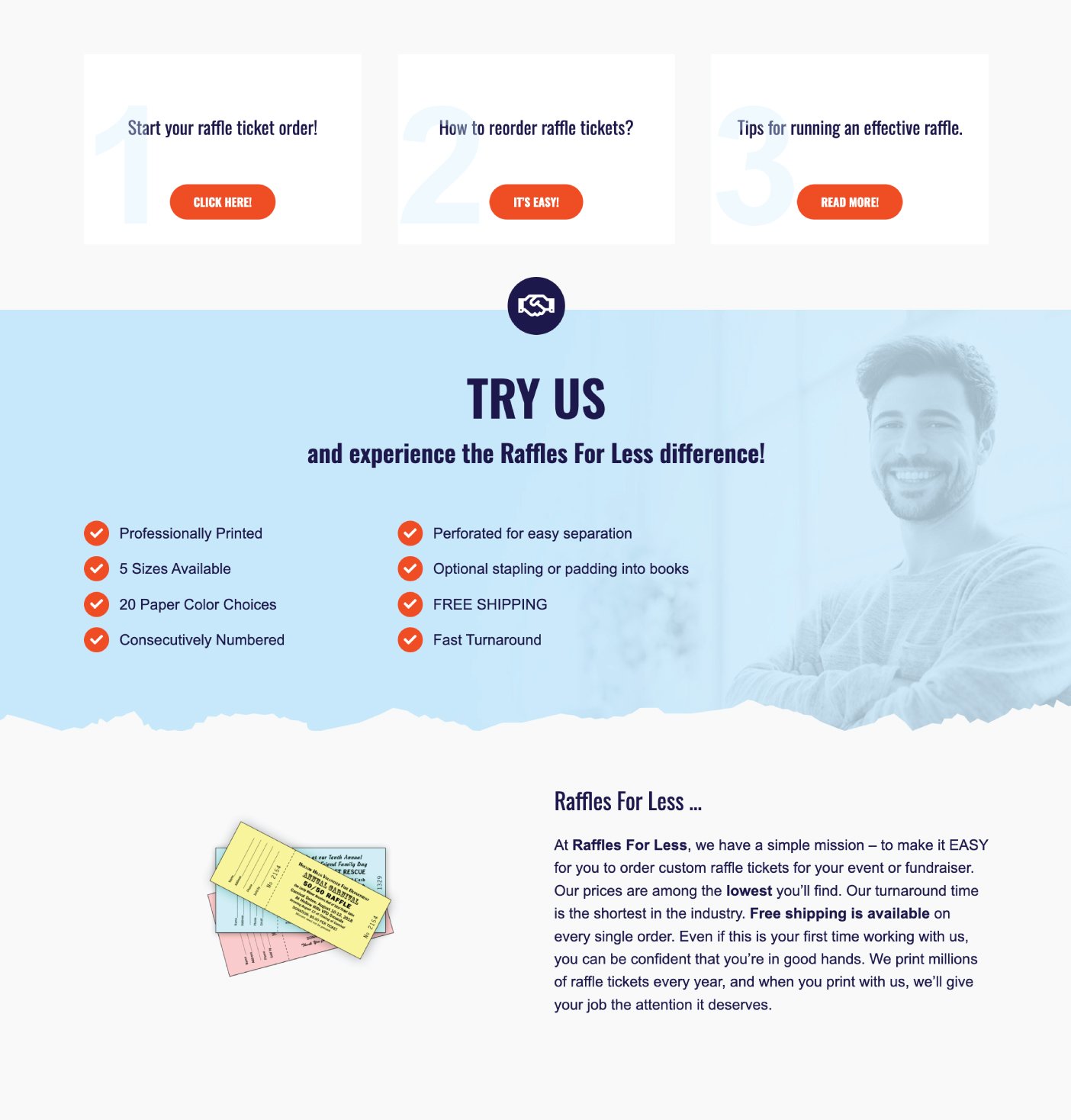
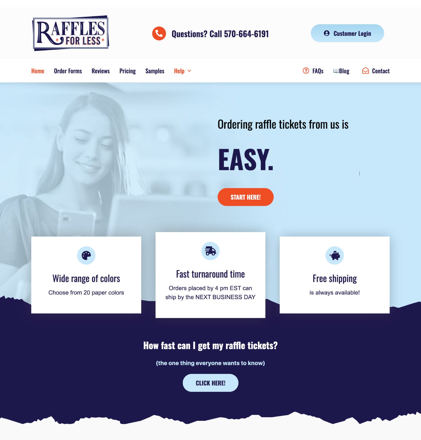
Raffles for Less – The website above showcases the redefined branding.

Raffles for Less – The stickers above are placed on the outside package of each order.
